Ilustrations
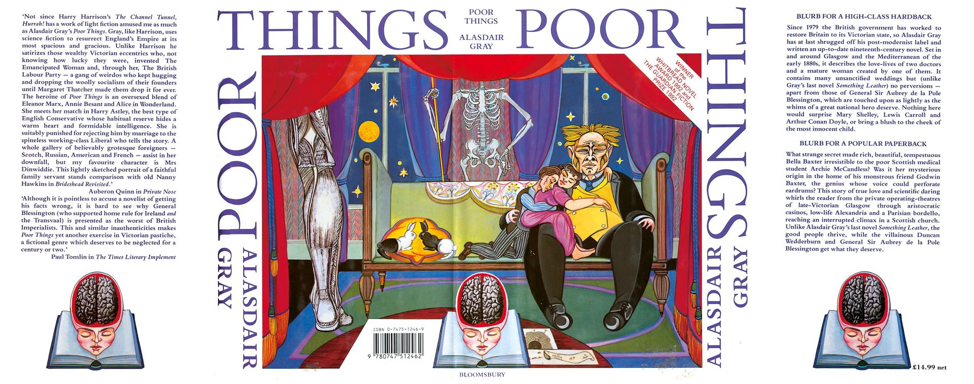
Poor Things (1992) illustration, courtesy AGA
Truth-telling, Space-filling and Paradoxes:
The Word/Image Relationship in Poor Things
By Anthony Remy
The following text is an edited extract from Anthony Remy’s forthcoming Ph.D. thesis 'Writing-Unwriting: The Paradoxes of the End in Contemporary English-Language Metafiction (Mark Z. Danielewski, Alasdair Gray, Lance Olsen, Will Self)', with special thanks to the author.
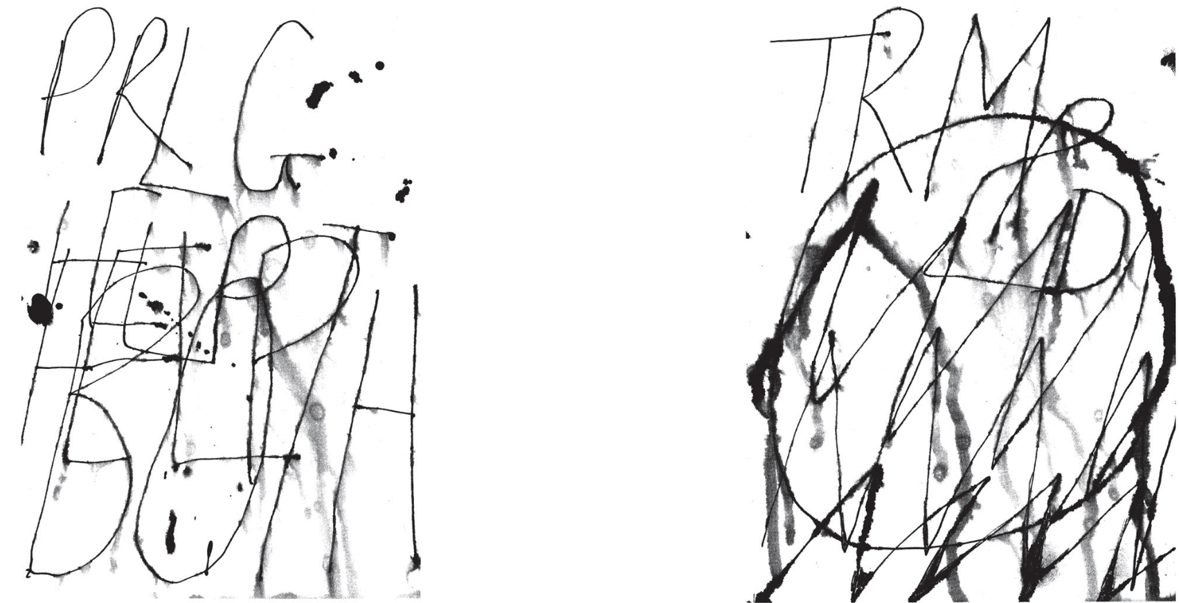
What might strike the reader most while leafing through Poor Things is its apparent visual aspect, given the various ways text appears on the page and, more obvious still, the number of images the book contains. Now, Alasdair Gray does not simply juxtapose text and images in his novel – despite his playful assertion that some of these images were used as “space-fillers at the end of chapters” (Gray,2010,p.48). Gray instead combines text and images in an intricate montage that namely “serves a distinctive purpose mixing up ethical, political, as well as social and aesthetic stakes” (Louvel, 2014, p. 181), a purpose centred on the distribution between fiction and history. According to Liliane Louvel,
Poor Things displays a complex structure including a dazzling word/image apparatus which manages to fool the eye right from the start. Atrompe-l’œil visual trap is laid out to the reader who cannot but be caught up in a complex verbal and visual labyrinth consistent with Alasdair Gray’s own training as a designer (Louvel, 2014, p. 181).
Also called iconotextuality, the word/image relationship in PoorThings is part and parcel of the question of narrative truth-telling that justifies the novel’s existence in the first place, as a so-called found manuscript. This complex apparatus, however, forces the reader to give up any willing suspension of disbelief, because “instead of making him believe this is the truth, it alerts him as to the workings of the apparatus, and calls his attention to the crucial issues [AlasdairGray] is trying to make him think about”. (Louvel, 2014, p. 190) That said, the role of Gray’s illustrations remains first and foremost that of entertainment and pleasure.
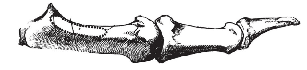
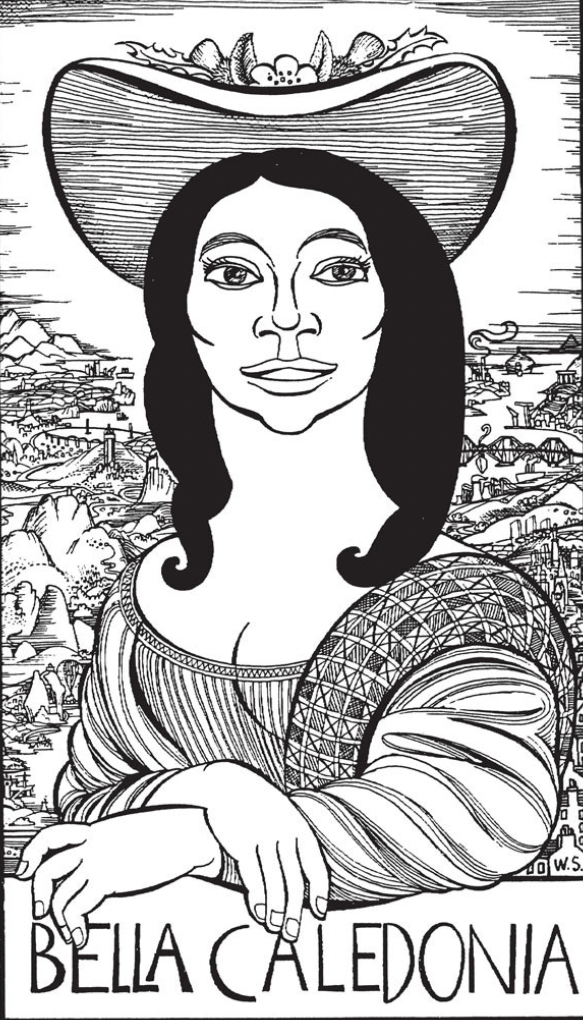
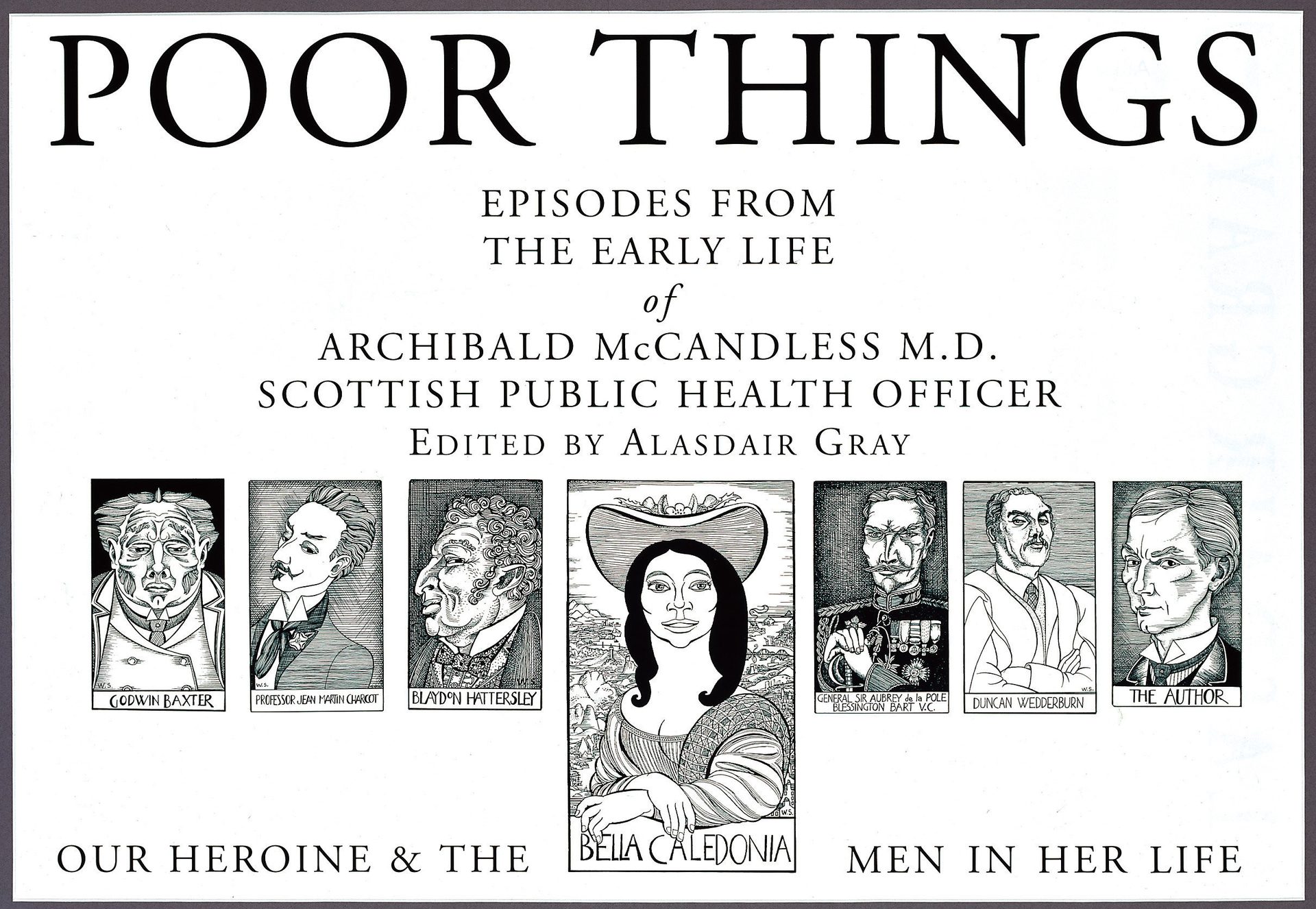
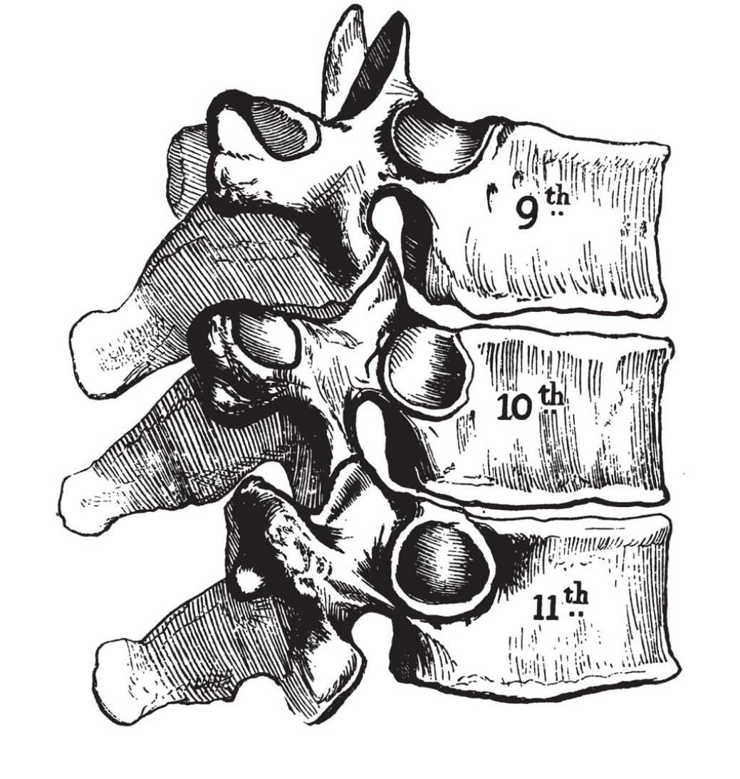
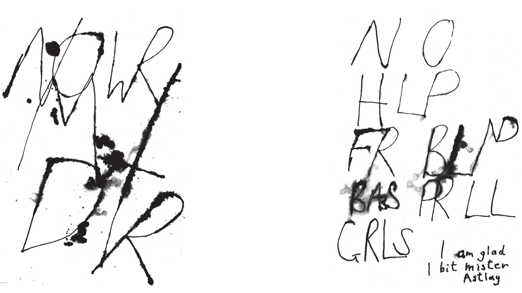
To give but a few examples: the etchings from Gray’s Anatomy McCandless uses to illustrate his narrative, 'probably because he and his friend Baxter learned the kindly art of healing from it' (Gray, 1992, p. xvi) confront reality, history and fiction, while humorously pointing out the pun on the name Gray shared with the author of the medicine book. The last sentences of McCandless’s chapters are usually centred on the page, tapering down towards one of these anatomical charts which serve as visual illustrations of the similarly visual, calligramic text. The three vertebrae at the end of Chapter 19, “My Shortest Chapter”, there by illustrate the reunion of McCandless, Baxter and Bella:
Eventually I sat by Bella, embraced her waist and rested
my head on her shoulder. She was not completely asleep, for
she moved her body to let mine fit it more easily.
The three of us lay a long time like that.
(p193)
Poor Things (1992) illustration, courtesy AGA
The description subsequently refers the reader to the book cover that depicts the three main characters comfortably cuddling on Baxter’s couch.
The materiality of Poor Things thus appears all the more significant. This set of textual and visual illustrations, among others in the novel, allows yet a new voice to resonate among the already abundant narrative and editorial voices, one that is conveyed through the very word/image relationship in Poor Things: that is, a metatextual voice.
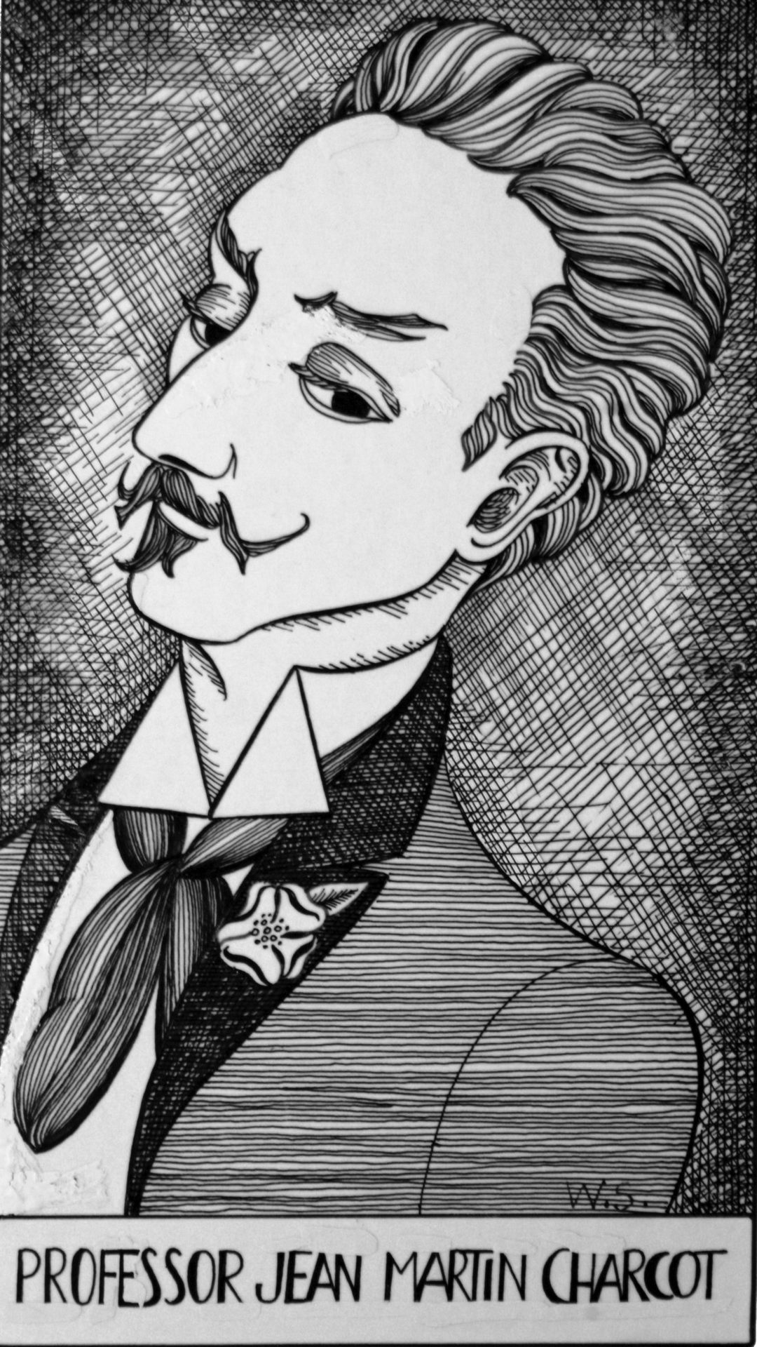
The latter also shows through the erratum slip of white paper allegedlyinserted in between the first pages of the novel and partly covering a page of fictitious book reviews. The mock erratum indicates that '[t]he etching on page 187 does not portray Professor Jean Martin Charcot, but Count Robert de Montesquiou-Fezensac' (p. v). Apart from the book cover, it is the first iconotext the reader encounters when reading Poor Things, thus questioning the authenticity of the narrative from the start. What is more, the reader can easily make out Alasdair Gray’s idiosyncratic drawing style in the portrait in question (as well as the other ones in the book), even though the editor (one of Gray’s aliases) attributes it to the Scottish painter, engraver and writer William Strang a few pages later.
Poor Things (1992) illustration, courtesy AGA
Nevertheless, the supposed substitution between the two portraits has the merit of foreshadowing some of the main Victorian themes Gray develops in his novel: medical sciences and female hysteria as regards Charcot, the Decadent movement and the issue of posterity with respect to de Montesquiou. In other words, here is Gray showing the ropes of his metafiction, whose purpose is to examine the building processes of fiction itself, thus deliberately reminding the reader that Poor Things is a construct in the first place.
The mock erratum, moreover, creates a layering effect within the two dimensional page, thereby illustrating Gray’s use of the colour white (the colour of the page) and its materiality as a palimpsestual image – an image that bears traces of an earlier form. This is made particularly apparent when McCandless reproduces six pages of Bella’s letter as a facsimile, explaining that '[t]hey are printed by a photogravure process which exactly reproduces the blurring caused by tear stains, but does not show the pressure of pen strokes which often ripped right through the paper' (p144). While drawing the reader’s attention to the materiality of the page, which McCandless emphasises with his remark, Alasdair Gray confers a fictional dimension to the white paper comprising Poor Things, in a way superimposing fiction on reality as the six pages blend text and image.
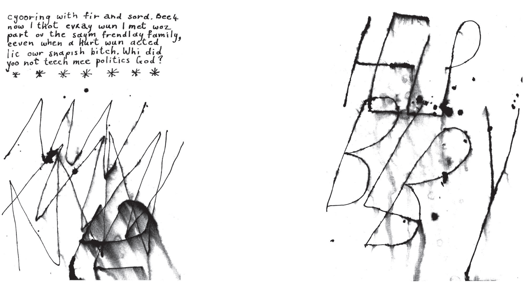
Poor Things (1992) pp.145-150, courtesy Bloomsbury Publishing
This is yet another exemplar of Gray’s iconotextuality whose main goal in Poor Things is “to perform an ethics of distrust and doubt partly thanks to what pictures render visible in a way more vivid (or in another way) than text can do”. (Louvel, 2014, p. 193) Put differently, the word/image relationship in Poor Things, despite the fact that it goes against any willing suspension of disbelief, serves as a means for Alasdair Gray to strengthen both the complicity and the proximity he establishes with his reader/viewer through his metafiction. This is perhaps what Gray meant when he described his images as “space-fillers” after all.